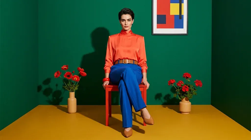
A decor makeover starts with paint, furniture, lighting, bedding and even curtains — in short, that wild urge to live through a change. The biggest hurdle is often choosing the color and the style: fear of being bold, of feeling overwhelmed, of making a tasteless mistake. To help you avoid any missteps, here's an overview of the colors that make a decor and their effects on our moods.
Which colors, and what effects do they have on our moods?
Color, generally speaking, influences our emotions, the way we see things and think about them — it shapes our everyday life. Everyone has a preference for a particular color.
Green
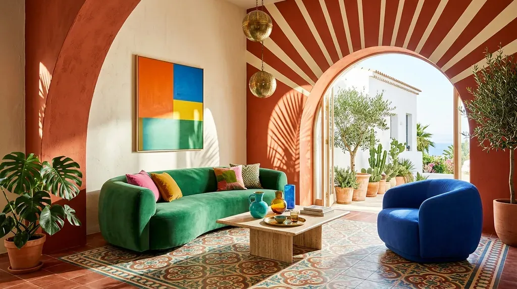
The color of foliage and trees, green symbolizes life, harmony, balance, success, optimism, youth and growth. It brings a feeling of peace and serenity: light green and its shades give a sense of freshness, while lime green or apple green bring joy and lightness. Several studies have shown a positive effect of green on both the physical and psychological level — researchers have observed an effect on physiology (heart and lung cells) and on blood circulation.
Yellow
The color of cheerfulness and light par excellence, yellow evokes vitamins and sunshine. It's particularly well suited to rooms used for studying and working, as it helps concentration — a very stimulating color for the nervous system, which should therefore not be used alone but paired with a soothing shade such as blue.
Blue
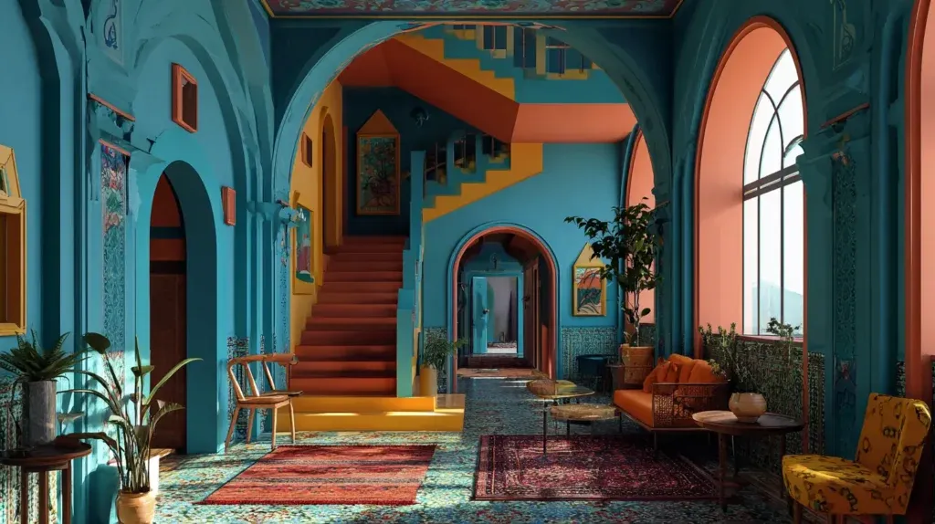
A classic color considered cool, blue encourages relaxation both physically and mentally, bringing a feeling of calm, trust, serenity and peace — it evokes the sea and the sky, and absorbs the negative energy tied to stress and anger. Light blue fosters creativity and suits study or work rooms; turquoise blue affects communication between people; dark blue, recommended for bedrooms thanks to its powerful sedative effect, promotes peaceful, deep sleep. Indigo blue, in furniture, tableware or linens, evokes a journey to the Mediterranean coast.
Orange
Like yellow, orange is a bright, cheerful color with stimulating effects, symbolizing boldness, intelligence and loyalty, not to mention warmth and radiance. On walls and furniture, this warm color gives a room conviviality and energy. According to experts, orange is said to fight low spirits and lift the mood; it is also said to act on the left side of the brain, which processes language, making you want to chat. Subtler shades such as peach or apricot are said to help restore nervous energy.
Pastel colors
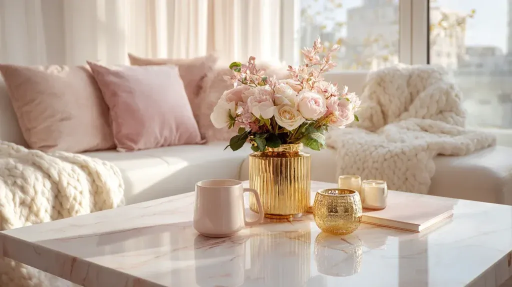
These soft, powdery colors, very fashionable in decorating, are no longer confined to children's rooms: they have conquered living rooms, kitchens and bedrooms alike. Soft pink, seafoam green, timid yellow and other shades bring a touch of serenity to an interior. Their subtlety lets them blend without clashing, but experts advise against overusing them — reserving them for a single element in a room, an armchair or curtains, say, avoids veering into a too-childish look. To pair colors without a misstep, our 3 pro tips for matching colors apply to decorating too.
Which material and style trends for a home makeover?
The jungle or tropical style relies on an abundant presence of plants: foliage on cushions and armchairs, greenery on wallpaper, curtains with tropical prints or potted plants stacked on shelves, right up to hanging plants. This style of decor evokes tropical forests and offers a feeling of purity and freshness — provided you keep an eye on plant care and any potential ant infestations. Insect motifs embedded on light fixtures or cushions add a more surprising touch of the same style.
From tropical to artisanal, shiny metals such as copper hold pride of place alongside rose gold. Polished, gilded or brushed, copper takes top billing in decor as in lighting — chandeliers, vases, decorative pieces and office supplies all revolve around this metal, which gives a room a luminous look. Long confined to the kitchen, it has now broken out to pair with wood, marble and other metals and materials, lending them extra splendor.
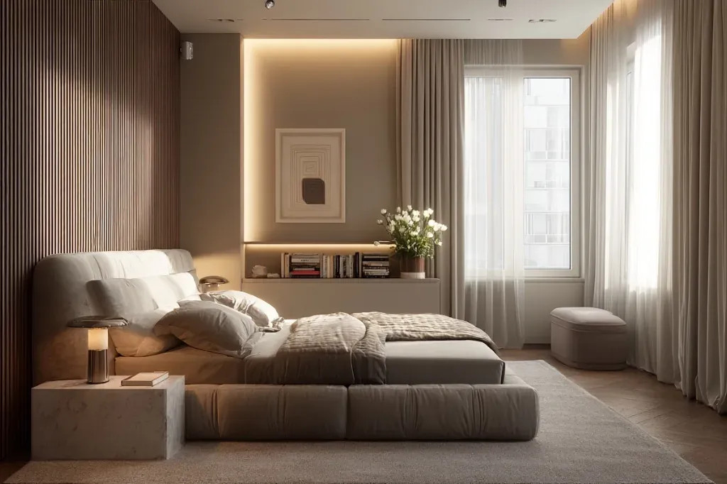
In terms of design, recycling, reclaiming and handcrafted work bring a much sought-after touch of creativity. Bedding has its own trends too: linen gives a lot of charm to bed linens and remains highly sought after in the warm season. In sheer curtains, linen is also in the spotlight — lightweight voile curtains that let in the sun while preserving privacy, from crinkled linen in a relaxed chic style to linen scrim, and cotton voile as well.
Dark blue is recommended for bedrooms thanks to its powerful sedative effect — it promotes peaceful, deep sleep.