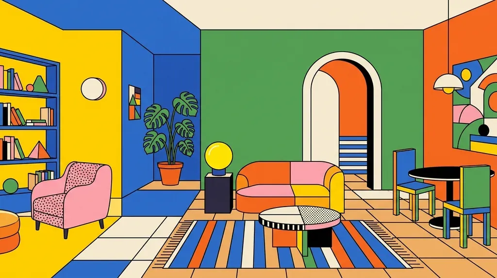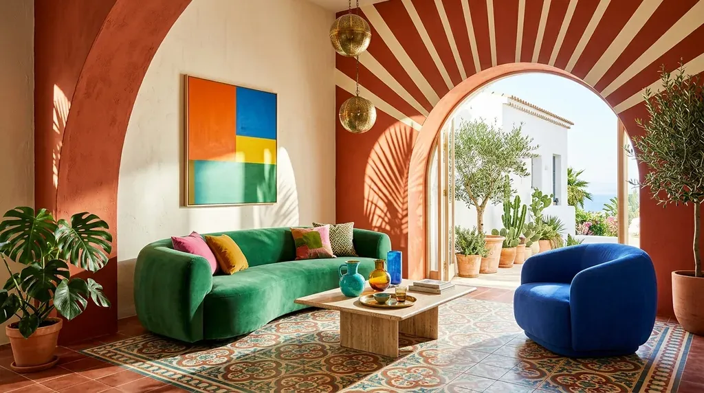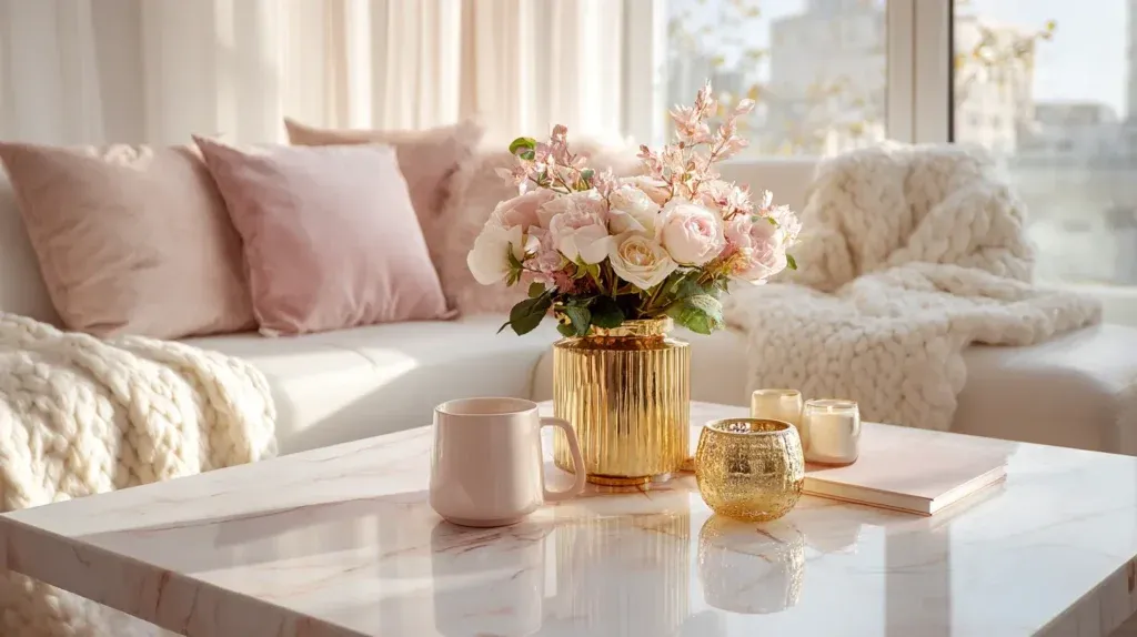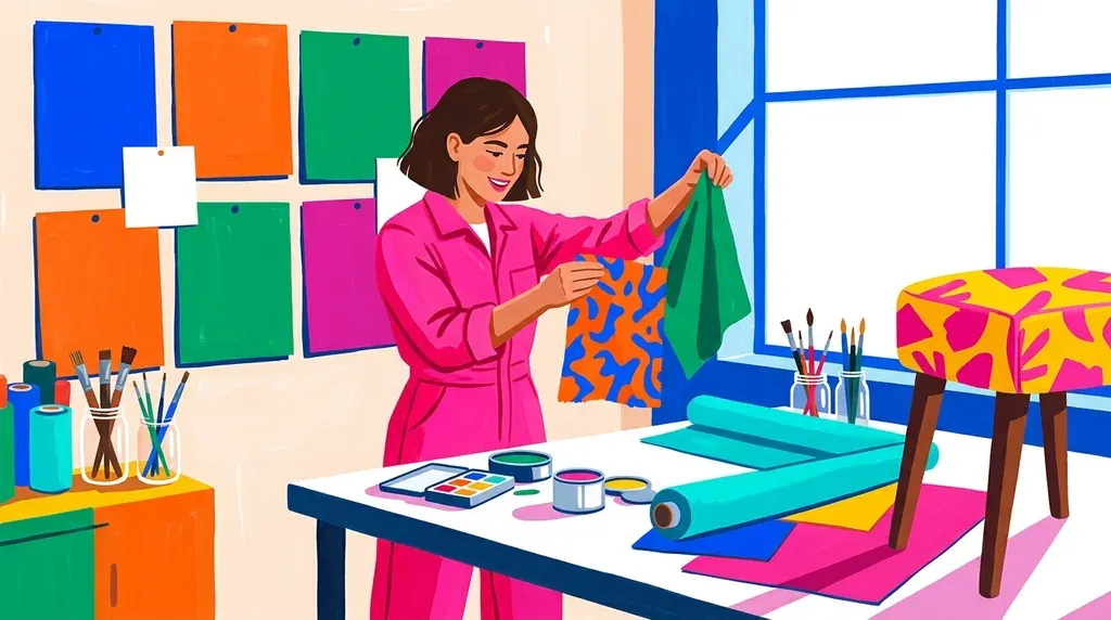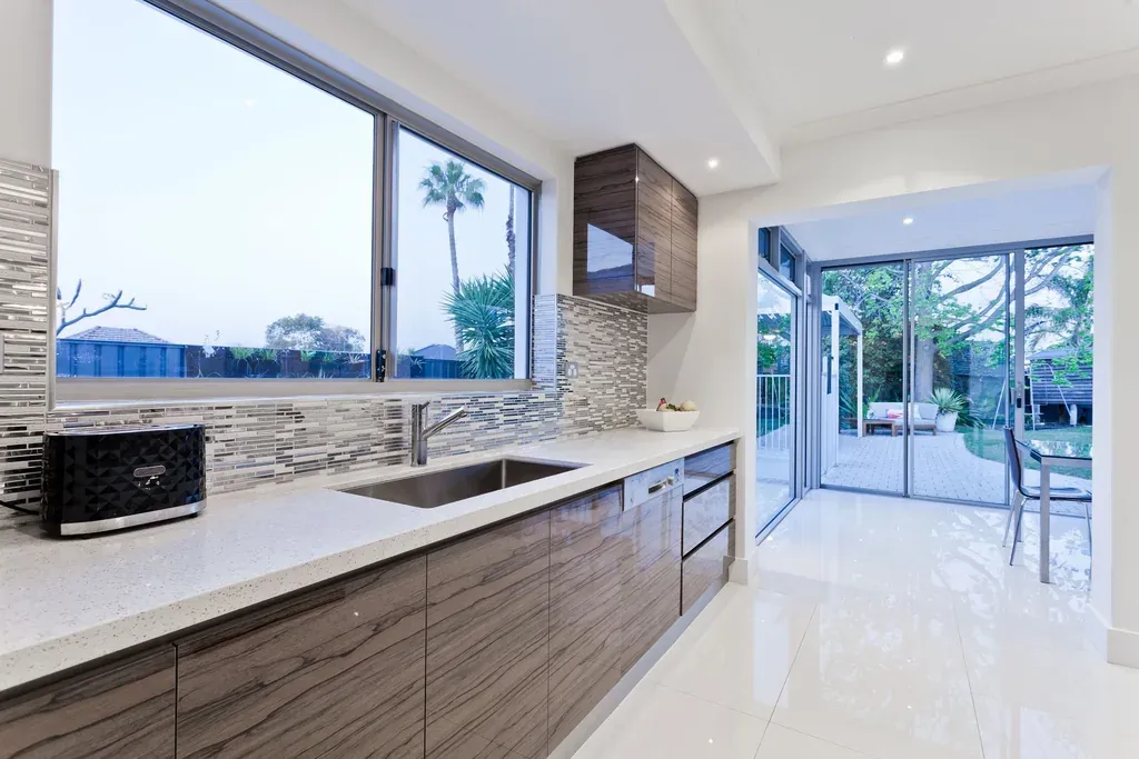
Colours transform our living spaces far beyond their purely decorative role. These living elements shape our mood, our energy and our everyday sense of well-being. Discover how the psychology of colour can revolutionise your interior décor.
Understanding the Psychological Impact of Colour in Décor
Thinking of colours in human terms helps us grasp their qualities. Far from passive, these shades behave like living organisms that stimulate or soothe our senses. They trigger particular physiological reactions and emotional responses we rarely stop to notice.
Although everyone reacts differently, a few universal guidelines steer us through this colourful exploration — enough to create a harmonious interior look with full awareness. Remember that our perception of colour remains subjective and shifts with the stages of life.
Choosing a colour for your décor is like choosing a lifelong companion.
Red: Energy and Passion in Your Décor
Red remains one of the most expressive colours in décor. This vivid, energetic shade carries an unshakeable confidence that never goes unnoticed. What is more, red affects us deeply on a physiological level, quickening our heart rate.
Ask yourself whether you can truly live with such a stimulating colour day in, day out. Red is like a hyperactive child that calls for patience and attention. Even so, this colour can deliver the boost you need thanks to its invigorating, tonic effect.
It all comes down to dosage, striking the perfect balance. Favour small touches in soft furnishings rather than painting entire walls: doing otherwise is one of the decorating mistakes to avoid. Steer clear, too, of using this warm colour in the kitchen, where the heat of cooking intensifies its natural energy.
Yellow: Optimism and Warmth in Interior Décor
This bright, optimistic colour is part of the recipe for happiness. Echoing the colour of the sun without its heaviness, yellow brings a warm joy to your interior. Yet this shade rarely works on its own and needs pairings to reveal its depth.
Yellow has a gift for elevating existing interiors. It looks its most beautiful paired with grey or aubergine. In this way, it lends lightness and freshness to a space that might otherwise feel stiff.
Orange: Vitamin Boost and Dynamism for Your Décor
The star colour of the 1960s and 70s, orange is gradually reclaiming its place in décor. This tangy, spirited shade evokes vitamin C and good health. Reintroduce it in peach and apricot tones for soft, fruity accents.
In its earthy version, orange recalls our Mediterranean palette and pairs divinely with olive green. Use it sparingly for sun-kissed touches without visual overload.
Green: Calm and a Natural Connection
Green is a perfect fit for people with a fast-paced way of life. Soothing and life-giving, it calls to mind the purity of nature and makes up for the lack of connection in our urban surroundings. This colour invites us to catch our breath and offers a welcome moment of respite.
Blue in Décor: Mediterranean Serenity
For us, children of the Mediterranean, blue belongs quite naturally to our decorative world. Traditionally reserved for outdoor façades, it is now making its way indoors. Soothing and peaceful, ethereal and mystical, it ties us to the sky and the sea.
Different shades produce striking effects:
- A transparent, watery wash evokes lazy summer days
- A brilliant cobalt blue combines serenity with vitality
- A steely blue-grey recalls the wild northern seas
- A pastel blue expresses a pure, gentle peace
Brown: A Natural, Warm Foundation
Many homes adopt brown by default through wood or leather. Yet it comes in warm, pleasing shades, from golden beige to indulgent chocolate. Brown deserves a prominent place in our interiors, just as it does in nature.
Everywhere and earthy, brown makes the ideal backdrop for every other colour. It creates a perfect base for layering several tones. On its own, brown can look bleak. Paired with green, blue, pink, yellow or orange, however, it brings a perfect balance between strength and emotion.
Pink: Softness and Femininity in Décor
The ultimate colour of softness, pink finds its place in any space that calls for calm. Blended into a broader palette (yellows, browns, greens), it lends femininity without any limit on family use.
Opt for a warm pink for a sophisticated take. Choose a vivid pink to get close to red without its drawbacks. Powder pink evokes a cloud of serenity, but keep it to your personal spaces — a useful principle, too, when you set out to arrange the bedroom.
Purple: Mystery and Spirituality
This colour is bound up with the mystical world and with spirituality. Precious and rare in nature, it remains little used in décor. And yet, applied sparingly, it invites reflection and contemplation. Aubergine, more modern than classic purple, pairs wonderfully with green.
Black: Modernity and Dramatic Intensity
Black is hard to carry off without a modern interpretation that breaks with its dark nature. To make the most of this colour, pair it with matte finishes and rough textures that temper its dramatic intensity.
Black absorbs the energy of a space and can quietly drain you. Use it, then, in small decorative touches, unless you are genuinely seeking that energy-absorbing effect.
Grey: Neutrality and Modern Versatility
Highly fashionable for its neutrality, grey has not always been popular. Yet there are countless shades of grey, far from the dull, drab tone. Tint it to give it the qualities of the added colour.
A pale blue-grey takes on the relaxing qualities of blue. A yellowish grey turns optimistic and dynamic. Grey offers its presence without drawing attention and highlights whatever surrounds it. It makes a lovely alternative to brown, which can sometimes feel imposing.
White: Purity and Luminosity in Décor
Often adopted by default, white deserves to be a deliberate choice. This pure, light and luminous colour possesses a humble, assured beauty. It offers an ideal backdrop for other colours to express themselves, letting them shine and flourish.
White carries a positive energy and a sense of light. It transforms a space by revealing the potential of every decorative element.
At a Glance: Each Colour, Its Emotion and Its Use
| Colour | Emotion / effect | Usage tip from the article |
|---|---|---|
| Red | Energy and passion | Small touches in soft furnishings; to be avoided in the kitchen |
| Yellow | Optimism and warmth | To be paired with grey or aubergine |
| Orange | Vitamin boost and dynamism | Sparingly, in peach, apricot or earthy tones with olive green |
| Green | Calm and a natural connection | Ideal for people with a fast-paced way of life |
| Blue | Mediterranean serenity | Makes its way indoors, in several shades |
| Brown | A natural, warm foundation | The ideal backdrop for every other colour |
| Pink | Softness and femininity | In spaces that call for calm; powder pink kept to personal spaces |
| Purple | Mystery and spirituality | Sparingly (aubergine with green) |
| Black | Modernity and dramatic intensity | In small touches, in matte finishes and rough textures |
| Grey | Neutrality and versatility | Tinted to take on the qualities of another colour |
| White | Purity and luminosity | The ideal backdrop for other colours to express themselves |
Conclusion: Mastering the Psychology of Colour for Successful Décor
Every colour has a unique personality that deserves respect and thought before use. Knowing their character traits allows you to live in harmony with them and to express your own nature. The psychology of colour in décor helps you create spaces that truly reflect who you are.